This new redesign of my site is here, and I’m happy with it. You might be interested to know a bit about what’s underneath…
The layout’s built on Gridset, a new tool made by the talented chaps and chapettes at Mark Boulton Design, designed to make putting together compound grids so easy a napping baby could do it, and Gridset makes it so with aplomb. I’ve always been a stickler for good vertical alignment and acheiveing the look of a grid even if I don’t always use one, so it just made sense to try out Gridset. It’s still in beta and I’ll probably end up paying for it, but I’ll be happy to.

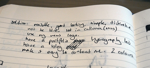
I started by writing out a short list of goals and constraints. They included insighful things like “reabable, good looking, …, not be blue”. Clearly, blue was to be avoided. Looking at them now I think I achieved everything on that list, except perhaps distinctive – although that’s probably the most subjective of the list.

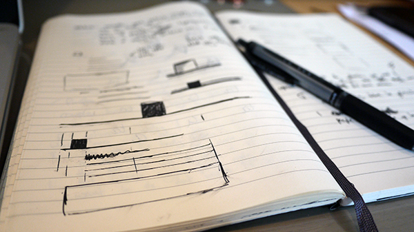
I then sketched out a few ideas and moved, perhaps unusually, to playing around with the navigation in Remy Sharp’s fabulous JS Bin. The sketches show a dark square with a border underneath, but I just couldn’t get this to look right, so I tried a sort of speech bubble, and suddenly it made sense. This, for me, is the stage of designing in the browser where those happy accidents occur. The instant feedback from live updates makes rapid iteration very easy and alot of fun.

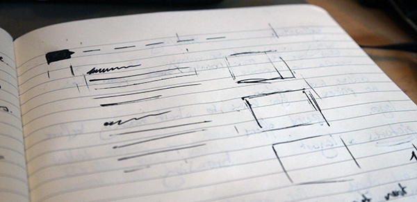
I then sketched out a rough layout so I could figure out where the key grid columns should go. You can see from this sketch that I was thinking of having a work showcase down the right hand side, but in the end I opted for a mini-bio. The sketch is very rough – as mentioned, I like to work mostly in browser.
From there I just jumped straight in the browser. The site’s built using on Jekyll, so I have that running in auto mode on my command line. It automatically regenerates the site every time any files change, and is also a little web server so I can (almost) instantly refresh the browser to see how things are looking. I also use LESS (and CoffeeScript), compiled by Codekit, to make CSS development a more pain free process.
With LESS I try to move all references to color from the rules to a group of variables at the top of the document. This makes changing things down the line significantly easier, although I must admit that on this design I was a little lax on that rule.

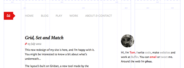
As I was building the pages I was modifying Gridset until I got the set of layouts I wanted. For desktop-sized browsers I’m using a compound grid where two ‘Golden’ grids (4 & 5 column) are combined to give a complex set of possible layouts, with a common gutter at around three-quarters of the full width, from the left. See the grid in action.
The grid builder is very easy to use and intuitive, although it would be nice to be able to set the gutter size in ems, as well as pixels and %. The predefined classes, like *-pad and *-padinfull, never seemed to work quite right for me; perhaps a symptom of doing something wrong.
Honestly, my first attempt at using a compound grid was not an enormous sucess as the grid I came up with is slighly awkward to work with. And with a vertical grid layout you have to think, and markup, somewhat vertically, meaning it’s difficult to break out of the grid horizontally, especialy in a CMS-like environment. Perhaps this is limitation of Gridset, or perhaps it’s something I’m doing.
All that said, Gridset was a pleasure to work with and theres’s so much I haven’t mentioned about the site and my experience with Gridset. The ease with which an adaptive layout can be thrown together is brilliant, as is the documentation that’s generated for your grid. Great work Mark Boulton & co; I’d highly reccommend trying out Gridset for yourself.
I hope you enjoyed a little insight into how this site was designed & built, and if you learned anything then that’s a bonus. It’s nothing special, but I find that reflective posts like this are good for me to figure out my process and what I could be doing better.