Watch out: this post is 14 years old.
Responsive workflow is a hot topic so, naturally, I thought I’d weigh in with my thoughts. But I’d like to clear somethings up:
Sketch
In general, I’ll sketch out as many ideas as I can. I’ve started using a six-up technique, gleaned from Robbie Mansons’s talk at New Adventures 2012 (and re-brought to my attention by Andy Higgs). You draw six boxes, quickly and roughly sketching six different solutions to a problem. I’ll do this twice, take four of the best, and repeat, mutating existing ideas. This way I can quickly iterate towards a solution.
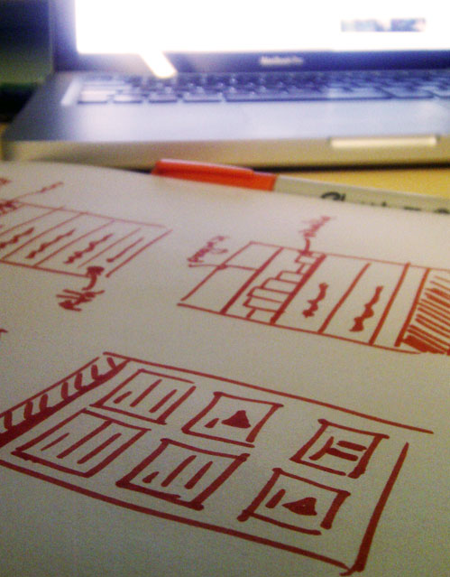
Whilst sketching, in my mind I try to have a picture of what the design would look like at many different sizes. Sometimes I’ll sketch these layouts too.
Code
Most of the time, I’ll then jump straight into code, putting together a basic structure & layout for the page. This will nearly always be fluid. While I don’t generally use grids, perhaps I should.
Typography
Typography is absolutely fundamental for a great looking website. Choosing the right typeface, size & line-spacing in order to establish a vertical rhythm is key, and one of the first things I do. I use Tim Brown’s Modular Scale to generate a harmonious grid, and then stick to these measurements as I move into Typecast. All sizes are in ems.
Typecast is a great tool, letting you use actual web fonts from Typekit, Fontdeck and the Google Font Directory live. It’s an increasingly important tool for me. Sign up for the beta — it’s definitely worth a try.
Photoshop
I’ll also often jump in and out of Photoshop; it’s far quicker to throw together layouts and prototypes than in code. You could almost say Photoshop is a sketch tool. I never do pixel-perfect mockups.
Breakpoints
Where would we be in a blog post about responsive design without talk of breakpoints? Quite far, it seems.
To me, breakpoints are exactly that. Wherever your design breaks, you’ve got a breakpoint. I’ll try to fix it with CSS first, with a media query as a last-resort. Don’t project your design onto specific devices, because that defeats the whole purpose of responsive design: device agnosticism.
Other stuff
Chrome Web Inspector is invaluable for making tweaks to a page before moving back to code. I’m not very comfortable with Firefox’s inspector, but they’re innovating in that area so hopefully it will be useful in the future.
Other browsers are also vitally important. Device agnosticism applies to browsers too, so don’t be snooty. Opera’s important too.
I hope this helps you when you’re working on a responsive design. Thanks for reading!